ViEmu Marketing Week
As I mentioned in my last post, apart from ViEmu and the kodumi editor, I’m working in another product. I tend to concentrate on development most of the time, rather than marketing ViEmu. Don’t get me wrong, not only do I think that marketing is second only to product quality as the most important part of this business, but I enjoy marketing. The reason is that I think that ViEmu can not become a large business, because of the inherently small audience of a vi-vim emulator for Visual Studio. Thus, I think that the best way to grow the business is to release a product for a larger audience, rather than trying to squeeze every extra N% sales by implementing effective sales techniques.
Anyway, there are two phenomenons that push in the other direction. For one, pure coding of a product before it’s released lacks the thrill of direct feedback, so it’s very tiring. At least that’s how I experience it. And second, any improvements in ViEmu sales make it directly to the monthly bottom line, which is a pretty good motivator.
Thus, after a solid coding Saturday, I decided to dedicate some time to marketing ViEmu better. There were two main things that were irking me:
- I get pretty good feedback by e-mail and through the forums, but looking at the number of downloads it still looks paltry. Not having a super-easy way to get feedback (esp. criticisms!) leads to my ignorance about why those that don’t buy ViEmu don’t buy it.
- The main page of ViEmu (also doubling as landing page from Google adwords) was a bit dull. Too much text. Informative for those interested, but I don’t think it really “grabbed” visitors.
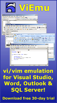
So, I dedicated all of Sunday to redesigning it, adding functionality so that visitors can send feedback from a simple form there, and making it more “catchy”. This ended up as an animated demo of Visual Studio running ViEmu. You can see the result here:
And, just for reference, the old one is still here:
I’ll let you know how it turns out to work. I am planning to implement some other marketing “tricks” during this week, as well as releasing ViEmu 1.4.5, and then I’ll go back to more coding and support, coding and support, coding and support…


June 1st, 2006 at 8:27 pm
I find the new main page much more appealing than the old one, good job! The animated demo gives some life to the page, but i find it difficult to follow what i’m seeing there. Well, given the fact that the only vi command i know is “:q!” this is not a big surprise, but i believe that even vi freaks could eventually feel confused. In the future, if you have some nice features to show you could try a screencast as seen on RubyOnRails or TextMate.
Also i’m very glad about your plans of releasing another product before the long awaited Kodumi. The development on these “secondary” products shows that you have a good and realistic business plan. It must not be very easy to focus on these not so “interesting” products instead of having more fun working in Kodumi. But you have realized that although not having so much fun these products are giving you good things… money, business experience, people attention, and above all motivation.
I have the strong feeling that you are moving forward towards a successful ISV. Keep on!
June 2nd, 2006 at 12:42 am
Thanks a lot for the praises. Indeed, it takes some effort not to concentrate on kodumi. But, on the other hand, I find the thrill of actually having a product “out there” and having happy customers a necessity.
You’re right that the actual editing shown there is not very compelling. I didn’t want something too fast as it may be distracting, but it’s actually not clear at all except for vi diehards.
I’m working in something better though. I’ll post about it as I get closer to it.
Thanks again!
August 11th, 2006 at 9:45 pm
Hi,
I can share a similar experience. I am a little ISV marketing Palm OS stuff and blogging about the Palm OS, Staff, IT world and Micro ISVness – but lets get back to topic.
I have a product caled Binary Clock that is in a similar situation as is yours. Its old web site was http://www.tamoggemon.com, and I eventually moved it over to http://www.palmbinaryclock.com.
I added download buttons, more screenshots,… and sales immediately went up. For a small shack, the web site is the number one selling point(dont rely on your ESD…ever) – so getting it higher on google is a must do, as is increasing download rates(huge buttons). Analyst feedback made me add the Reading button, and all of that at next to no cost.
I didnt have the time to write about this on TamsPalm yet, but will do eventually for sure!
Best regards and thanks for motivating me
Tam Hanna
August 31st, 2006 at 6:28 pm
Tam, thanks for sharing your experience. I apologize for not getting back to you earlier. I plan to release 2.0 in a few days, which should help with sales, and I plan to widen the catalog later on… hopefully, all the marketing work together with the product improvements will help.
Best luck with your product,
Jon