Next steps & screenshot
ViEmu 1.0 has been out for two weeks now and I’ve had some interesting feedback. I’m getting ready ViEmu 1.1, which solves some limitations in the integration with VS – ViEmu will take over all editing windows within VS, instead of being a separate editor type. This helps with the VB form and HTML editors within VS, and also with not getting the standard editor instead of ViEmu through some UI elements which are not completely correct within VS (such as the “View Code” button which bypasses the whole internal VS editor mechanism).
I think I will be able to release ViEmu 1.1 next week. This will address all the major outstanding issues in 1.0 and, with the exception of unforeseen bugs or problems, it will be the latest released version for some time.
Right after that, I will be getting back to NGEDIT. I’ve had the chance to think quite a lot about NGEDIT during the development of ViEmu, and I will probably start by doing some refactoring of the code. Apart from this, there are two major pieces that are missing before I can feel comfortable with how complete the tech base of NGEDIT is: syntax highlighting and regular expression search. I also want to improve the core memory management code, so that it will better lend itself to hex editing of files and storing other types of information.
There are a myriad other things to do then, in order to cover what the expectation of a modern text editor is. They will take quite some time, as each little detail needs its own love and care. But, after the refactoring and the major two features, I will already be able to start focusing on the most important part: the UI. I have a ton of ideas that I’m looking forward to implement and try out.
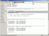
I thought it may be time to post an early screenshot of NGEDIT. It is from April, quite incomplete, but gives a good idea of the general look. Toolbar icons in large to appreciated the drawings 🙂 (click to see a full size version)

Given that I’ve checked out the beta of VS2005 to do the porting of ViEmu to VS2005 (which is already working), I’ve seen that Microsoft have gone with a similar look for the gradient-based UI background. With a bit less taste, if I may say so myself 🙂


August 11th, 2005 at 12:43 am
Excuse me, but your cut/copy/paste icons are not very easily identifiable. I think the same applies to New/Open/Save icons but they are somewhat more identifiable than other three. My 2 cents. I am sure by the time you are ready to deliever the editor, it will have it all beautified! 🙂
JD
August 11th, 2005 at 12:43 am
Very nice looking screenshot. And it looks practical!
August 11th, 2005 at 1:01 am
Looks nice.
And I wouldn’t worry about toolbars too much. I doubt many vi users use clipboard *buttons* instead of hotkeys or registers.
August 11th, 2005 at 2:26 am
JD, you are especially right with the cut icon, which is hardly identifiable (I think the other two more or less are). I think the regular “cut” icon (skinny 1-pixel-wide scissors) is probably the ugliest in any toolbar. Yes, some more work is necessary on the icons – and on many other areas.
Colin, thanks!
GPF, thanks – anyway, NGEDIT is *not* targeted at vi fans. vi emulation is there from so early because, in order to test it myself, I absolutely needed it!
Regarding toolbars – I always hide it myself in, for example, Visual Studio. I’m a kinda heavy keyboard user. Even many non-vi programmers use the toolbar really little. And the icons shown in the screenshot are for the functions for which most people know the shortcut (Control-N, -O, -S, -X, -C, -V, -Z, -Y are almost idiomatic for new, open, save, etc).
Although I’ve seen C++ programmers who worked with me use almost exclusively the *mouse* for everything!
August 11th, 2005 at 12:35 pm
I don’t use toolbar buttons either, unless no shortcut exists. Even then I prefer to navigate the menu (e.g. Alt-F, then “p” to print).
In my opinion the whole point of using a single editor for most things, is so that you can learn all shortcuts and never use the mouse.
August 11th, 2005 at 3:04 pm
Your coding style brings back old memories. Did you used to code using a Borland product at some point (in particular, C++ Builder)? 🙂
August 11th, 2005 at 10:39 pm
You have the makings of a good product for vi “preverts” like me. Two items that I would like before I put my money down:
– must support regular expressions in the incremental search mode
– implement ex editor functionality (i.e. %s/^foo/bar/g) in the “command line” mode
Wish you the best….
August 12th, 2005 at 7:27 pm
Dimitris, I also use keyboard navigation for menus, and try to minimize mouse use. But there are quite many people out there who do use the mouse, even a lot. I have to cater for both things in NGEDIT.
Andrey, hmm… I did use Borland C some time (BC3.1, I think), but I’ve hardly use it and I doubt the style is due to that. What elements make you think so? Would be nice to comment on that…
sfsm – I guess you’re refering to ViEmu. Those two elements are the clear improvements to ViEmu. Full command line support is probably quite a lot of work, although I’ll have to investigate. I use it somewhat, but I’m not the kind of user who knows all ex commands by heart. I’ll probably get to that on some time, although it also depends on how sales of ViEmu evolve. I find it really hard to estimate the size of the market ViEmu is targetting (that is, the number of, as you put it, “vi perverts” who use VS).