Archive for the ‘misc’ Category

Cool Vim/ViEmu video!

Thursday, December 13th, 2007

Aaron Jensen is a vi/vim lover and a long time customer of ViEmu – several programmers on his team use the various versions of the product.

He’s now preparing some vi/vim-tutorial screencasts, and he’s posted a teaser screencast, which has a great soundtrack and is awesome to watch:

Vim Screencast Tutorial Teaser

Cool!

viemu.com revamped

Thursday, December 13th, 2007

I’ve updated the design of viemu.com’s home page, mainly in order to incorporate a sidebar with a few goodies and a “testimonials” page:

Hear what others are saying about ViEmu!

The reasoning is that ViEmu has received a lot of praise and love over the last years, and I wanted this to be shown on the main page. Some people might feel they are the only ones interested in such a product, and the truth is that they are members of a now pretty large brotherhood. Having a small pic and a link to the worldwide ViEmu customer map also helps in that department. I feel that the new viemu.com home page reflects the ViEmu customer base and activity better than the previous, “drier” one.

I chose to only include web testimonials – stuff that has been posted to blogs and web pages. It lends more credibility and is more verifiable than text-only excerpts from emails, and there is plenty of material just on that medium. Some of the emails I receive are almost love letters. Even the comments on the testimonials page are so utterly flattering that they are almost embarrassing! Have a look if you want to see customer love in action.

_why used my vi/vim cheat sheet!

Wednesday, December 12th, 2007

_why, the author of the awesome “Why’s (poignant) guide to Ruby“, just used my vi/vim cheatsheet on his hackety blog.

Can you believe it? I’m immensely proud.

This guy is a hero among the Ruby crowd. I love his style, although I’m not sure he is mentally very sane. His creativity is amazing in any case. Be sure to check out his stuff, if only to take a walk on the edge of the programming world.

hackety

The Vi Gang Sign

Monday, November 19th, 2007

Back in May, I finally decided to sit down and write an article I had been thinking about for a long time: an article that would actually explain why vi/vim editing is really more productive than other editing models. Since I became a vi(m)er myself about 3 years ago, I had actually talked a few friends into giving it a try, and, oh surprise, a few of them really ended up using it permanently. There is something in an in-person presentation from someone you trust and respect that makes people less likely to turn on the hyper-sensitive bullshit-filter. If you read about a random person using vi/vim on the net, you just end up discarding it as “yet another nuthead” and moving on. I wanted to write an article that had some non-zero chance of jumping over that first hurdle.

Also, I felt that most write-ups available didn’t do a good job of presenting the actual, practical advantages of vi(m). As a tutorial, I felt that my graphical cheat sheet and tutorial from March ’06 had done the best job possible for a simplified tutorial and quick-reference: this page is now the biggest traffic driver to viemu.com, and a very widely used resource – see this photo as a sample:

(Original Link). You can see it features someone’s desktop (Will Simpson’s actually, not that I know him really), and seeing the vi/vim cheat sheet in such a privileged position makes me really proud!

Also testament to the tutorial’s popularity is the fact that the cheat-sheet/tutorial page is heavily linked to around the web, and thanks to that it’s the 2nd to 4th result for “vi cheat sheet”, “vim cheat sheet” and its variations, also 3rd for “vim tutorial”, and on the first page for “vi tutorial” – these are quite high-traffic searches for a widespread yet difficult to master text editor like vi/vim.

Still, I wanted to write an illustrated, light-hearted and entertaining article to tell the story about vi/vim editing. I felt this was missing. I wanted to make it an easy read and present it in a somewhat playful tone, rather than a dry technical article. The tone was important, and some illustrations would help in the visual department. A big-block-o-text is never the best way to attract and keep someone’s attention.

Somehow, I had recently stumbled into the following photo:


Paul Tuckfield flashes the vi gang sign on stage during his keynote, “Scaling MySQL at YouTube”.

This was a great find! I had never heard about it, but having a ‘vi gang sign’ was totally cool. What other editor has a gang sign? An ‘emacs’ gang sign would require, at the very least, two extra thumbs. Very appropriate.

I searched for other references to the vi gang sign on the web, and got to find a few. For example, the following: VI Gangstas. These pictures portray a single-handed version instead of Paul Tuckfield’s two-handed one. It really seemed much nicer than the two-handed one. A single-handed sign is easier and quicker to flash, and I simply liked it better than the two-handed version.

So with this information, I decided to use my limited but beloved drawing skills (beloved by me, of course), and drew up a graphic to head up the article and set up a playful tone for the whole thing. The title was also chosen somewhat to this purpose. You can see the result here: Why, oh WHY, do those #?@! nutheads use vi?, which if you’ve been following my blog won’t be news to you. I wrote it up, prepared screen captures of the presented cases, had it reviewed by some friends, and finally published it. I submitted it to reddit and other social news/links services; the article proved pretty popular with this audience, and well over 40k people came over in the next couple of days (and hopefully read it!).

But there was a surprise I hadn’t foreseen: soon after it appeared on the reddit front page, a few redditors over there pointed out that this was indeed very, very close, almost identical, to an obscene gesture with a sexual connotation called “The Shocker”. Here is a link to the mostly SFW wikipedia article describing it, but don’t click if you prefer not to get the detailed description of a seriously obscene hand gesture with a sexual connotation. I had been totally unaware of this, and I had been flashing it at the top of my now-pretty-popular article!

I was mildly anxious about it, but rationalized not changing it in the following way:

  1. The sign is not exactly the same, as the shocker has the index and middle finger together, while the vi gang sign has them in a ‘v’ shape (a little problem is that my version hadn’t emphasized that separation and was closer to the shocker than necessary).
  2. If someone doesn’t know about the shocker, there is no problem at all
  3. If someone does know about the obscene version, then whose fault is it really?

So I decided to forget it, leave it up, and not give it much importance. After all, it even added another playful hack to the article (although I certainly wouldn’t like to find myself explaining that part of the joke to my mom!).

A few months passed, and I had mostly forgotten about it. I had told the story of the sign to friends over beers just for fun, but that’s about it.

But last month, I had another surprise waiting regarding to the issue: I received the following email from rhockens (someone I didn’t know beforehand):


Hi:

The first time I saw the vi gang sign was on your site at:

http://www.viemu.com/a-why-vi-vim.html

Doing a search for it, seems like I’m late to the party. Anyhow, a coworker who paints asked me if I’d like him to paint something for me, so, since it was kind of in his style anyhow, I asked for a rendition of the sign based on the one at your site.

Thought I’d share it with you:
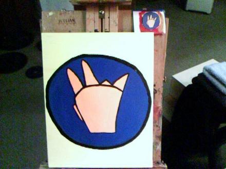

Ugh! Someone had inadvertently gotten into obscene hand gestures through my drawing! I was seriously proud to have a real painter decide to do a rendition of my drawing as physical oil on canvas, but there was some not so nice news I had to communicate. I wrote to rhockens with the news, and this was the response I got:


Oh my. I read up on “the shocker.” This just gets sillier.

I’ll defer to the artist, David, regarding posting it, but I’m sure he’d be fine with that.

Finally I got in touch with David 23, the artist himself, as I wanted to thank him and ask him for permission to post about the story. This was his response:


Hello Jon,

You are welcome to post the picture on your blog.
If you want to link back to my blog it’s at http://david2312.blogspot.com

A friend of mine told me about the shocker after seeing my painting… I assure you it’s the vi gang sign and nothing else. I hadn’t even heard of the “shocker” until after the painting was finished.

Glad you like it.

Best,
– David 23

I’ve had a look at David’s blog and works through his personal site. I really like his work – here are links to David 23’s personal web site (cool domain name!), his art gallery, and the one out of his paintings that I like the most.

Now at least I have someone else exposed to the same misunderstanding and reaction as myself. Isn’t it good to share experiences like this?

And isn’t it fun where editor wars can take you?

More on pricing, and new ViEmu-specific blog announcement

Tuesday, November 13th, 2007

Just for completeness’ sake, I thought I’d announce that I’ve also decided to raise the price of Codekana at the end of the month (from the current US $39 to $49). This has been posted on the Codekana web site since last week, so that it won’t be a surprise to those starting the trial during this month, and it will be effective on December 1st, together with the new ViEmu pricing.

I’d also like to let you know that I’m starting a purely-ViEmu-specific blog. I’ve often missed having a venue where I can assume that readers are either users of ViEmu, or interested in ViEmu details. I’ve always felt that the majority of readers here are more interested in the business side of things, and that talking in too much detail about ViEmu-specifics wouldn’t be interesting to them – yet I often have details I’d like to post about ViEmu. I will use that blog for release announcement, feature discussions, hints & tips, and possibly even venting about the quirks and warts of Visual Studio, Word, Outlook and SQL Server, as related to ViEmu.

I still have to style the blog to match the rest of the ViEmu site, but I thought I’d announce it and start posting even before the looks are finished – the content should be interesting per se!

New, totally cool web site for Codekana

Thursday, October 18th, 2007

I’ve just uploaded the new web site & design for Codekana. If I may say so myself, it’s somewhere in between totally cool and incredibly awesome. I think it also conveys the value and functionality of Codekana much better (there is a ‘Case Studies’ section, as well as a much more elaborate ‘Features’ section).

Next week, assuming I have sufficient inspiration, I’m planning to write & publish a technical-yet-entertaining article about the technology that underlies Codekana. It should be helpful in raising the awareness about the product.

Phew, this new web site has taken so long that I’m totally happy to have it up & running!

Of course, all feedback is very welcome. Let me know what you think.

Focusing is difficult

Monday, September 10th, 2007

If you are starting out, focusing in a single product is a great idea. Actually, if you can focus in a single product all the time, it will be much better for your productivity. I’ve been overwhelmed just by the sheer amount of stuff I have to do, in almost completely unrelated areas, that I’ve been pretty much blocked from advancing significantly in the past week.

Over the weekend, I have finally formalized my roadmap for the next few weeks:

First, I have to finish the Codekana release process. I know, I know, it’s already been released for one month, there is a 1.1 version already out there, there are a lot of users, etc… but there are some things I haven’t done, and which I like to consider part of the release effort. One, notifying some people explicitly about it, and possibly contacting both dead-trees and online magazines. Apart from this, I’d like to write one or two articles with the potential to become popular on reddit and other social sites, which can bring certain awareness. One has to walk very carefully the fine line between promotion and interesting content to get there, but I think I can pull that off. And it will help a lot with growing traffic to the Codekana web site. There is one additional note here: since I want to publish this article in the Codekana web site for SEO purposes, and since the current web design would make it pretty hard to read it, I will have to revamp the web design before publishing it. All this is priority #1, as I’m doing Codekana a disservice until I provide some exposure.

Second, I want to address some outstanding issues with the ViEmus and prepare new builds. Continuously improving a product over a long period helps a lot with customer satisfaction and the success of the product. I have only done very minor things to the ViEmus in the past few months, and I want to do this before I embark in a major development burst again.

And finally, only in the third place, I will be working in new Codekana features, my Kodumi text editor project, and more ambitious marketing/exposure projects, which include setting up new blog(s) and writing several articles I have the theme for, and for which I just can’t find the time. But it just doesn’t make sense to engage in these activities until the current issues above are properly addressed.

There are two extra tweaks to this “grand plan” which are worth mentioning: first, I am kind of impatient, so I should just wrap my mind around the fact that each of these will easily take weeks. I tend to grow impatient seeing the list of pending things, and trying to finish the current one quickly. It just doesn’t help. And second: while I’m working on each of of the items, I should just erase the others from my mind. Important and interesting as the other things may be, they’re just a distraction until their moment arrives.

Oh well, I had to get that out of my chest. I’ve felt pretty stressed lately.

As a closing note, I’ve been trying to move this blog over to using Feedburner. There are a couple of reasons, the main one being that I’d like to get a more precise count of how many people are reading the blog and show it on the sidebar. Since I browse the http logs every once in a while, and since rss aggregators send the subscriber count in the referer string, I know there are about 200 people subscribing through these services, plus probably at least 100 more subscribing directly. Not bad for a blog I don’t update all that often, and which has often taken second place to actual product and development work. Anyway, I already set up the Feedburner feed, and I also installed a wordpress plug-in that should automatically redirect all subscribers over there, but it seems it’s only working partially. The feedburner subscriber count is showing only 120 readers now, and http logs show that many requests (notably those from bloglines and newsgator, which many people use) are getting a 304 code (“Not modified”), instead of a 307 (“Temporary Redirect”) which is what the Feedburner plugin uses. There are two potential reasons, one being that the transition won’t be complete until I post a new article (which I’m doing right now, so I should find out quickly), and the second being that I should really upgrade my wordpress installation, which is using and older version (I’ll probably do this in a couple of days). I’ll update this and let you know which one it was as soon as I find out, in case you ever have to do the same thing.

[UPDATE: A new post seemed to do the trick. The subscriber count is now added to the sidebar.]

Desperate to stand out

Wednesday, September 5th, 2007

A friend of mine is a designer. She’s not specifically a graphic designer, but she has a great talent for graphic design too. I recently showed her my Codekana web page, as well as those of other products in the same or a similar space. You see, I was quite proud of the web page and its ‘bold’ look, although I knew it was a tad too aggressive. But she nailed it when she said what she thought: “it looks desperate to stand out”. Ouch! That kind of feedback can be hurtful at first, but it’s definitely the best kind of feedback you can get. She elaborated a bit on what things made her thought that, and they were all spot on, of course.

I’ve received some other “actionable” feedback about the web page. The awesome Andy Brice, author of the best-selling package for wedding seating plans and the mind behind the cunning write-ups and experiments over at SuccessfulSoftware, gently reminded me that I didn’t mention what languages Codekana worked with in the whole web site. What an oversight! Of course, I promptly fixed that. The supported languages are C/C++/C# in the current version, although I will be adding support for other languages in the future, and improving the support for the current ones. Andy also sent me some excellent suggestions on the product, which I plan to address Real Soon Now. And he also posted about Codekana on his blog, which is very helpful (thanks Andy!). It doesn’t look like I will be getting married any time soon, but I will definitely try out his software if I ever get to that point 🙂 Also, Andrey Butov, while busy releasing a new version of his Blackberry spam filter, found the time to have a look at the Codekana web site and let me know that the colors were just hurting his eyes. He couldn’t look at it for over 30 seconds.

I will redesign the web site around all this feedback, tone it down a bit, and try to give it a more relaxed and professional look while keeping a distinct look. But I’m happy I went a bit over the line: if you are learning something, you need to allow yourself to overshoot.

I now have at least a handful of different large areas of work, including marketing and improving all my products, web design, tweaks to the sales offerings, and what not. For each product, I have dozens if not hundreds of suggestions and requests that are waiting for some attention. My to-do lists are pretty daunting. So of course, now comes the moment of prioritizing tasks.

As a first priority, I decided to work in Codekana 1.1 during August, and I finally released it last week (see the list of changes in Codekana 1.1). A 1.0 is always a bit rough, and giving it some quality time is very important to get closer to “product/market fit” (as the amazing Marc Andreessen likes to put it – if you haven’t already, and you are into startups in any way, I suggest you read every single of his blog posts about startups and entrepreneurship). All in all, 1.1 is a more solid product, and I’m already looking forward to 1.2 with a few more improvements.

In any case, I expected low sales in August, as I had in August ’06. But it turns out they have been very good – ViEmu has been equal or better than in previous months, and Codekana sales have been ok-ish for a first month. Now September is finally here, with everyone back at work and hopefully even better sales.

Although there are a couple of things I want to work on in the next few weeks, I have finally come to the conclusion that my next major product release will be kodumi 1.0, my always-work-in-progress text editor, and the final goal towards which I’ve been working for well over two years now. I have also decided that I don’t want to rush a 1.0 and release a text editor with nothing special over the many offerings out there – it just wouldn’t make sense. With advanced syntax highlighting courtesy of the Codekana engine (which will also be part of the editor), I now have almost all the core functionality needed for a standard modern text editor, but I have decided against taking that route. There are some parts of the core new tech I want to get up to speed, in order to release a product that Stands Out on its own without requiring aggressive colors and huge fonts on the web page.

The short term priorities include some work in new releases of the ViEmus, a bit of marketing work here and there, a bit of blogging, and some tweaks to the sales offerings. Of course, I will release new revisions of all my products while I work in kodumi 1.0, but the main focus in the mid- to long-term now is to get kodumi out of the door.

Wish me luck!

Why, oh WHY, do those nutheads use vi?

Thursday, May 17th, 2007

I’ve written an advocacy article… well, no it’s not advocacy… well, YES, it IS an advocacy article, about vi/vim editing. The main goal is to have an explanation so that NON-vi(m)ers can understand what the fuss is all about, and why me, and many other thousands of people (including all my customers) still use vi/vim, and (at least my customers) go as far as paying me $70 for the privilege if they happen to use Visual Studio, Word, Outlook or SQL Server. Many of them even deem it a bargain.

Without further ado:

Why, oh, WHY do those #?@! nutheads use vi?

Enjoy!

ViEmu around the world

Monday, April 2nd, 2007

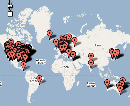
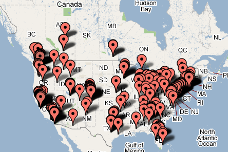
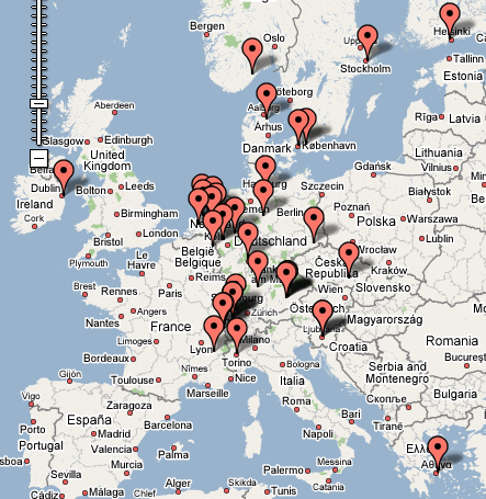
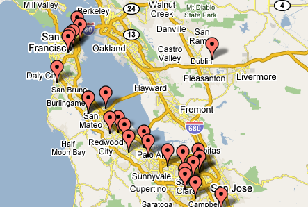
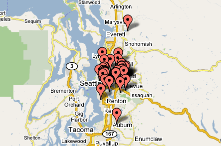
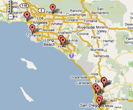
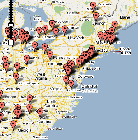
It’s not my fault. Ian Landsman started, and I just couldn’t resist. His blog post describes a cool php component to use the Google Maps API and show a list of addresses in a map. He used it to show where Helpspot (his popular help desk software application) customers are. And I had to do it. A couple of hours and quite a few manual fixes later, here are some cool takes (not all of the addresses resolved, and the ones who payed through Paypal, including as a few Chinese customers, aren’t shown here either):


All around the world!


The U.S. and Canada (most of my customers)


Europe (UK addresses don’t show up)


Japan and Korea – there are a lot of customers in Japan, but I had to reduce it to just cities


The bay area.


Seattle


Southern California


And an overview of the East Coast.


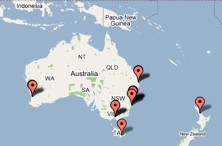
Even in the land down under!

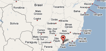
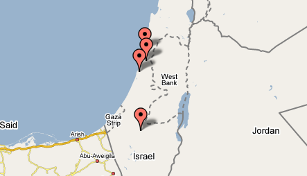
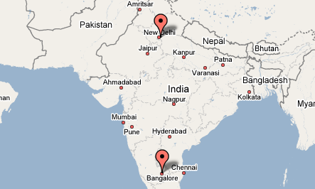
And here are a few exotic places – now how cool is that?


I’m planning to set up a ViEmu-specific blog in the next few days, and I was meaning to post this there – but I just couldn’t resist! I may even add some of this to the ViEmu home page, it makes for a good, reassuring visual explanation that ViEmu is used by lots of people around the world!